Ryan James Cook's logo.

Graphic Designer. Writer.

The man himself, Ryan James Cook.

My name is Ryan Cook. I’m a Graphic Designer based in Los Angeles, California. I’ve taken a long and winding road to get here.

I earned my B.A. in Philosophy in 2015 and published a paper in Moral Philosophy and Politics. After graduating, I worked as a copywriter for a few years. Throughout that time, I was a part-time fencing coach. After figuring out that full time copywriting wasn’t for me, I made fencing my full-time job. As much as I love fencing, I felt that creativity was missing from my life. Now, after coaching for nearly a decade, I’m a graphic designer. I can’t wait to see where life takes me next!

A book cover for Soren Kierkegaard's "Either/Or: A Fragment of Life."

As a Philosophy major, I studied several different philosophers. This is my redesign of Soren Kierkegaard’s Either/Or. In it he presents two diverging paths: an aesthetic, passionate life; or a conservative, traditional life. This cover captures that idea.

A document explaining how to take care of fencing gear.
A poster with definitions for fencing terms.

As a fencing coach, I wanted to help students and parents understand how to care for their fencing gear. I created a guide to help them understand the basics of maintaining their equipment. I always appreciate opportunities to combine my writing skills and design talents.

During my time as a fencing coach, I had the privilege of managing my club’s fencing program. I created this banner to help students learn the vocabulary of the sport. I prioritized readability and tied it into the club’s special ranking system.

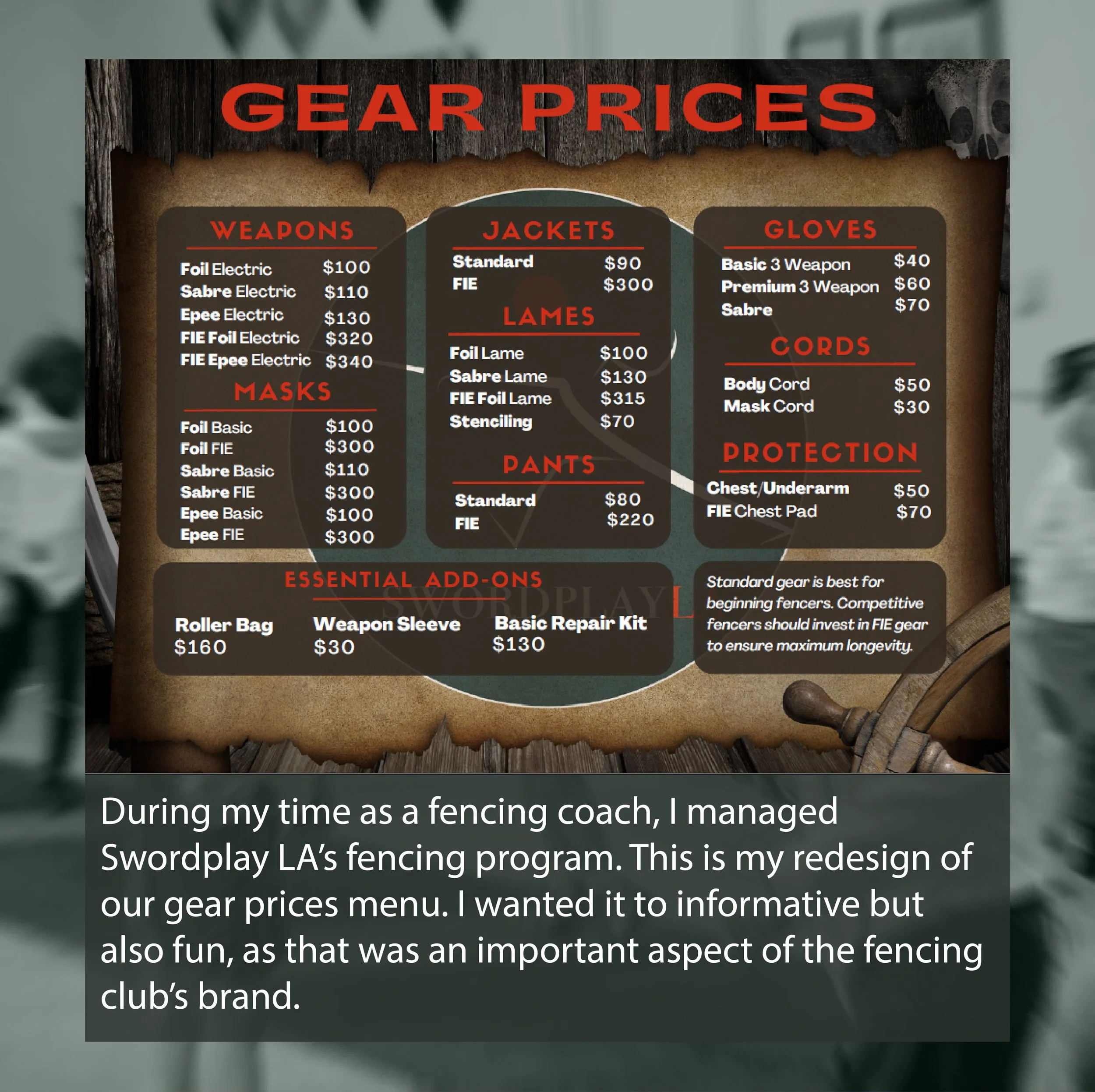
A menu of prices for fencing gear on sale.

I managed the equipment side of my club’s fencing program, too. This is my redesign of our gear prices menu. I wanted it to informative but also fun, as that was an important aspect of the fencing club’s brand.

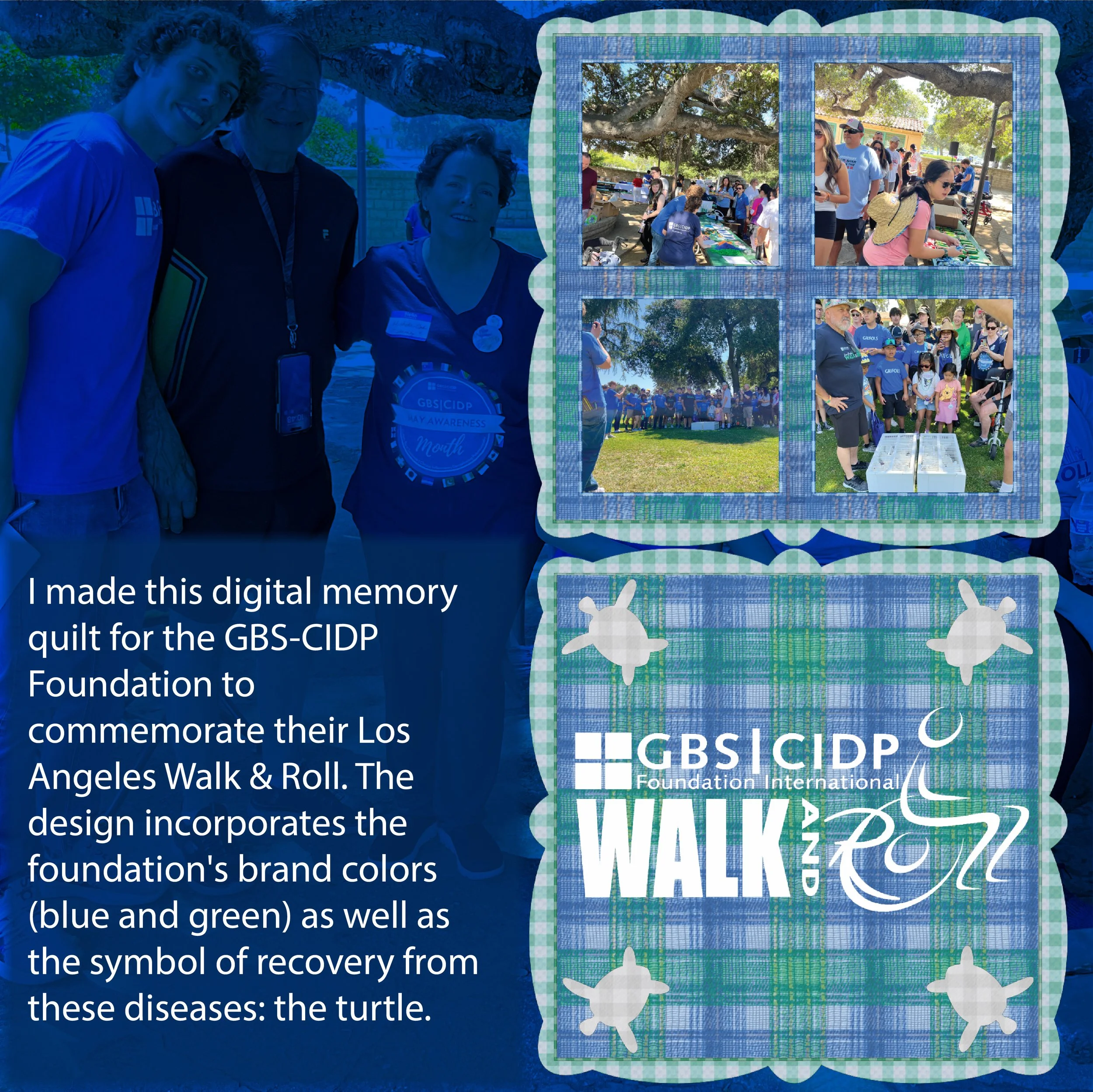
A digital quilt created for the GBS-CIDP Foundation.

I made this digital memory quilt for the GBS-CIDP Foundation to commemorate their Los Angeles Walk & Roll. The design incorporates the foundation's brand colors (blue and green) as well as the symbol of recovery from these diseases: the turtle. 

A logo created for an artist, featuring a turtle.

This is my redesign of a client’s logo for their art business. They were beginning to explore oceanic themes in their art, and they wanted their logo to reflect that.

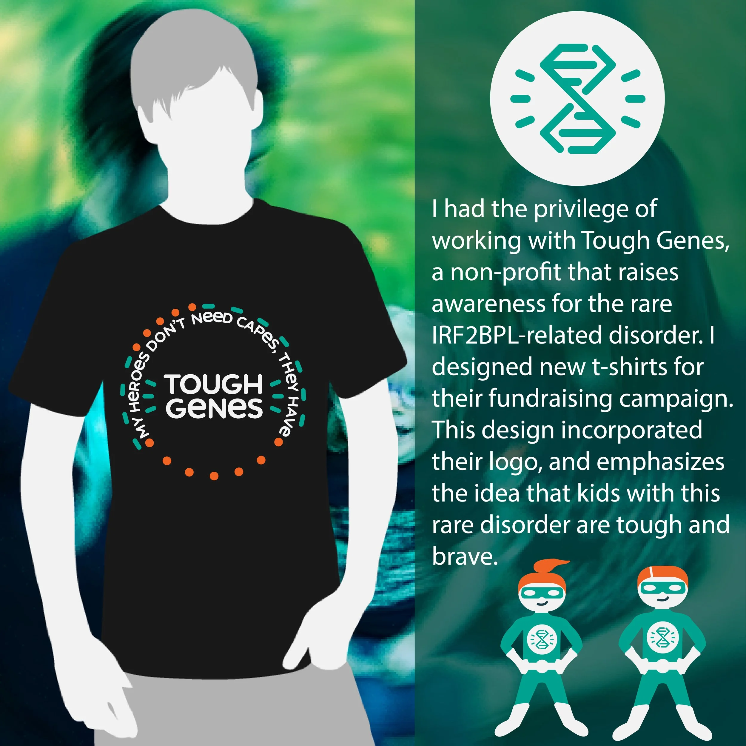
The front design for a kids' t-shirt.
The back design for an adults' t-shirt.
The front design for an adults' t-shirt.

I had the privilege of working with Tough Genes, a non-profit that raises awareness for the rare IRF2BPL-related disorder. These are my designs for their brand-new t-shirts.

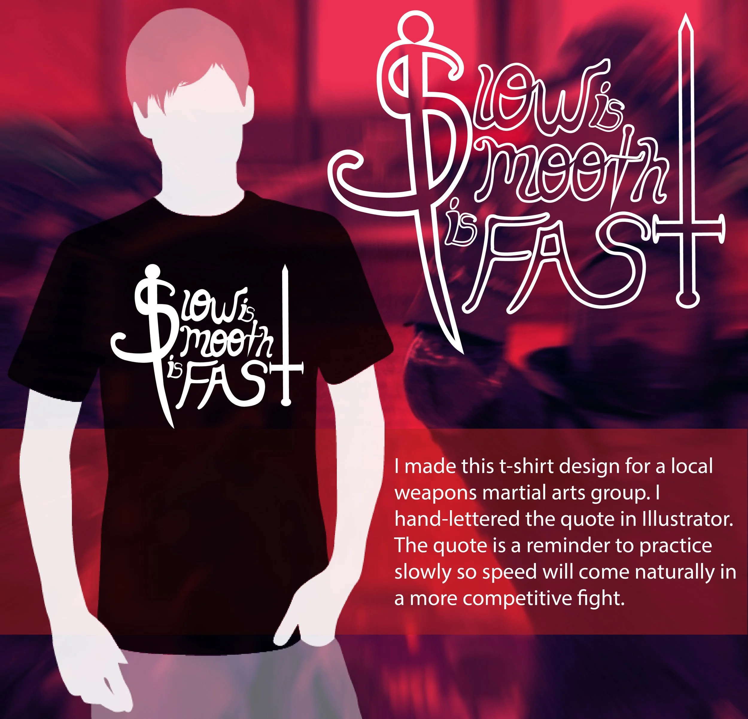
A typographic heavy metal logo.
A logo featuring a star.
A typographic heavy metal logo.

I worked with a streamer client to create a unique logo. Many streamers have logos with a sporty vibe, but 7Heavy wanted something more metal. His notes for the logo were simple: “A 90’s metal band logo with a little bit of Satan and anarchy.”

A globe logo enclosed in the number 10.

I’m proud to have partnered with You Matter 2, a non-profit organization that empowers disadvantaged youth. They commissioned me to redesign their logo for their 10 year anniversary.

A digital fret board featuring cannabis and an anarchist slogan.
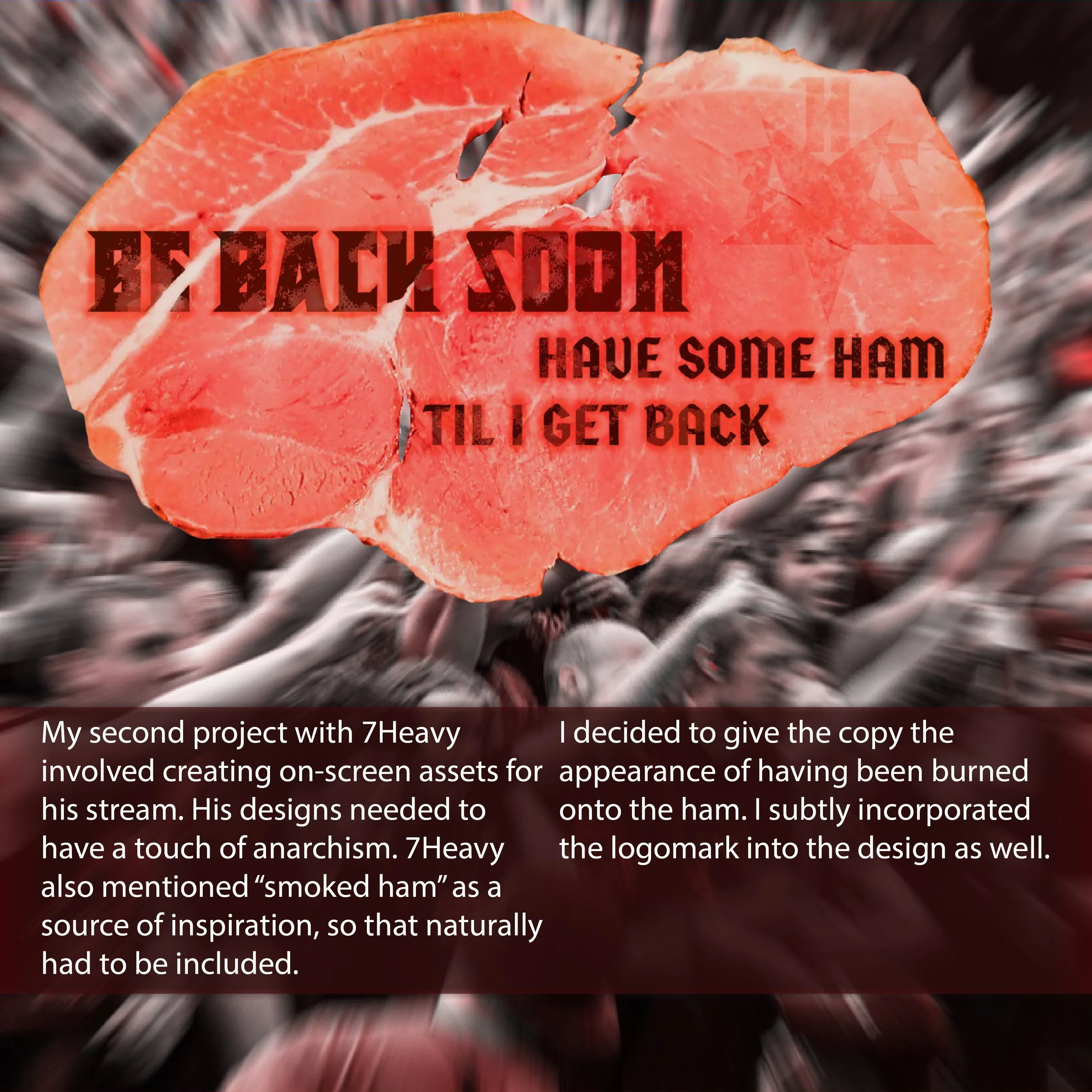
A logo and copywriting on sliced ham.
Two logos on sliced ham.

My second project with 7Heavy involved creating on-screen assets for his stream. His designs needed to include elements of absurdism, stoner culture, and anarchism.

I had the privilege of creating navigation icons for Flying Pigs BBQ. I built the icons around their already existing logo. I created the icons in illustrator and built the app mock-up in Figma.

(That’s a fencing pun. If you know, you know.)